Brand revision
Brand research & development
Visual identity design
Campaign
Copy
Consultancy

Brand revision
Brand research & development
Visual identity design
Campaign
Copy
Consultancy
Background
Java Roastery is an independent coffee house chain and a reseller of coffee and machinery with stores in Moseley, Solihull, Colmore Row in Birmingham and Coventry. The existing visual identity was dated and did not have ‘stand out’ in a crowded market. Along with a requirement for a visual revision, the intent for the brand was to be all things coffee; knowledge and expertise, machinery, workshops, accessories and clothing, with the possibility of further product developments in the future.
The launch of the brand was developed to coincide with the enlargement and refit of the original Moseley store.
Approach
Initial research into the coffee offering/store market served to confirm owner, Akram’s business direction and involved the change of the business name from JAVA LOUNGE to JAVA ROASTERY. This served to encompass a move to a complete coffee offering.
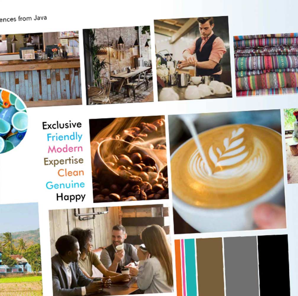
Utilising research we conducted in the market, Forty49 developed the brand positioning, vision, mission statement, brand values and the rationale behind the visual identity.
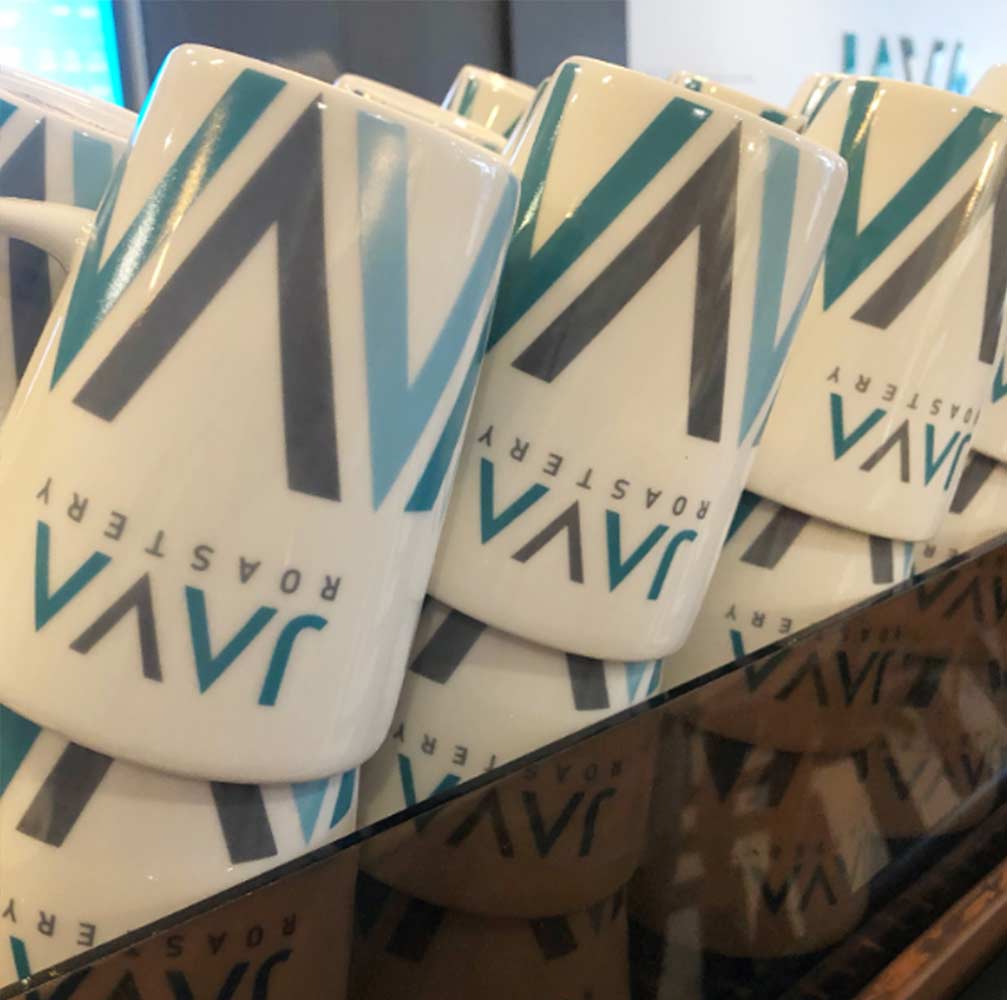
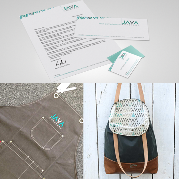
A clean, fresh logo design created a motif of the A and V shapes in the name. The design and colour choice was a deliberate move away from typical coffee iconography that can get lost in a crowded market.
Brand identity launch
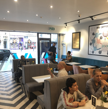
The reopening of the Moseley store attended by suppliers, customers and press was the ideal platform to launch the new brand. Interior design utilised the zig-zag motif and colours from the logo in the flooring and counter design. The clean, rustic wood elements echo the Scandinavian touches in the poster.
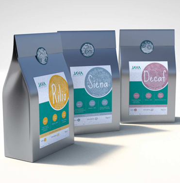
We then designed labels and icons for each of the house blends’ packaging to tie in with the identity.
The brand story
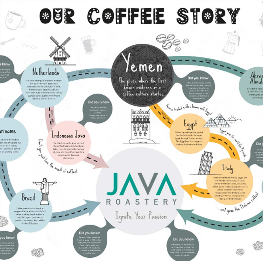
Coffee culture, and the brand owner have roots in Yemen. To extend this story to customers, we designed a piece of large-scale wall art which tells the story of coffee and its origins in Yemen as well as the owner’s family connection. The design took the clean lines and colours of the logo as a launch pad for the design, graphics and appealing typography which engages interest for customers in the stores.
